A Key Formula for Digital Health
Or, how to estimate the addressable market for a digital health product.
The Formula
One of the key formulas I think about when evaluating digital health solutions is the following:
Addressable Market =
(# of Members Covered by Payor) x
(% Prevalence of Addressed Condition in Members) x
(% Enrollment Rate in Solution) x
($ PMPY Savings)
And I wanted to share it with you.
Why use formulas? I’ll leave that to The D.O.C. and Dre.

With this formula, you’ll be able to determine the addressable market for any given digital health solution that sells to payors. This will be a critical piece of information to keep in mind, whether you are investing in or operating a digital health business.
The Breakdown
So let’s break this down:
# of Members Covered by Payor
If the payor is a commercial insurer (e.g. UnitedHealth or Anthem), this is equal to the number of covered lives. If the payor is a self-insured employer, this is equal to the number of employees with health insurance benefits.The holy grail is landing one of these employers:

Side note: It’s amazing that Walmart is the largest employer for nearly half of the states in the USA!
% Prevalence of Addressed Condition in Members
This is one of the key strategic decisions you’ll make as a digital health company — which health condition(s) are you going to try to improve? The most successful digital health companies (like Livongo) have started off by focusing on one disease vertical (like diabetes) and expanding from there.
As you can see from this 2016 CDC report, the conditions with the highest prevalence in the general US population are: obesity, hypertension, hypercholesterolemia, heart disease, cancer, cigarette smoking, and diabetes.

Focusing on one of these high-prevalence conditions would be good in terms of increasing your total addressable market, but beware that there is also a lot more competition in these spaces as well. This variable is also assuming you are focused on disease management instead of wellness - see my previous post about the pros/cons of each space.
% Enrollment Rate in Solution
This is another key factor in your business success - even if you sign up a customer with a significant population of the condition you are focusing on, can you actually get individuals to enroll?
Generally speaking, enrollment into employer-sponsored health programs is pretty abysmal. There’s even a whole segment of businesses in the digital health space that are specifically focused on solving this problem, exemplified by the recent IPO of Accolade that raised $220M. But how many of you have received mailers from your employer or an employer-affiliated health program that look like this…

…only to quickly chuck them in the recycling bin because they weren’t relevant to you?
There’s got to be better ways to engage with employees than what currently exists, and if you can crack that nut, you’ll be on your way to a great digital health business.
$ PMPY Savings
Now we are looking at the final variable, PMPY — which stands for “Per Member Per Year” (other time variations frequently used are Per Participant Per Month (PPPM) or Per Member Per Month (PMPM)).
PMPY measures, on average, how much money each member who is subscribed to a payor’s health plan consumes per year (often broken out by different conditions/health services). Specifically, here we’re interested in how much your digital health solution saves the payor in terms of PMPY compared to their current spending.
Here is relevant data, with Medicare as the payor:

That means that the average Medicare beneficiary (of which there are over 44 million in the US!) costs Medicare $440 a year in diabetes treatment, resulting in a $19B annual bill for Medicare for diabetes alone. Yes, that’s Billions with a B.

But the table above should give you an idea of which conditions will be most interesting to payors right off the bat (and also why so.many.players have started off in the diabetes space in the last couple years). It also generally puts a cap on how much your solution can charge the payor annually from a disease management perspective.
Case Study (Livongo)
Okay, case study time! I love case studies because they allow you to apply theoretical frameworks like the above to the real world and really test your understanding.
I’m choosing Livongo for this case study for a few reasons. First and foremost, Livongo offers a great source of benchmarks given their 2019 IPO and the information that was submitted publicly as a result. Second, Livongo is a pioneer in the virtual care segment of digital health and is one of the more recognized names.
Let’s google some stats, look at Livongo’s S-1, and plug them into the variables we’ve identified:
(# of Members Covered by Payor): 94M
Livongo mainly targets self-insured employers as their primary customer base. The most recent estimate is that ~94M lives are covered by self-insured employers in the US (ref).
(% Prevalence of Addressed Condition in Members): 9.4%
The CDC estimates that approximately 9.4% of the general population, or ~30M Americans, has diabetes (ref).
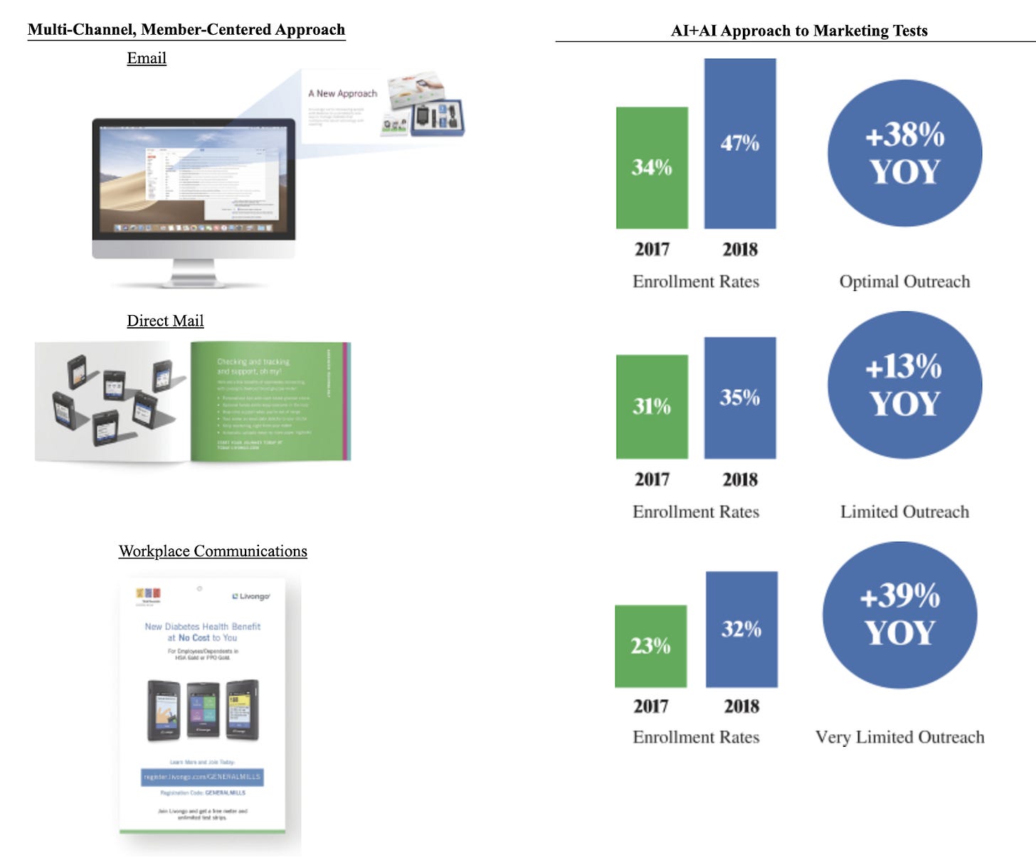
(% Enrollment Rate in Solution): 35%
From page 127 of the Livongo S-1, their 2018 enrollment rate for their “Limited Outreach” approach to prospective members was 35%. Let’s be a little conservative and go with that number, as opposed to their “AI+AI” approach (is it really necessary to repeat the word AI twice?)

($ PMPY Savings): $1056
From page 5 of the Livongo S-1:
Unlike many healthcare solutions, we enable upfront savings and a strong return on investment across many clients. For example, with Livongo for Diabetes, we have been able to demonstrate average client savings of $88 per participant per month (emphasis mine), or PPPM, in the first year of use based on a difference-in-difference cohort analysis
$88 per member (they call it “participant”) per month translates to $1056 per member per year.
Multiply the above, and you get an immediate Total Addressable Market (TAM) opportunity of $3.2B dollars a year for Livongo, if every self-insured employer in the United States were to sign up. And this doesn’t include if commercial (e.g. UnitedHealth or Anthem) or government payors (e.g. Medicare and Medicaid) were to sign on as well.
Livongo is currently trading as of July 8, 2020 with a market capitalization of $10.2B, which doesn’t seem crazy now that we’ve done the TAM calculations.
Variations
We can make this formula more precise by adding in these additional variables:
Condition Severity (all else being equal, you will generally see more savings for enrolled members who have a more severe version of a condition)
Average Member Tenure (it’s estimated that the average American only stays on their health plan for 2-3 years before switching or dropping it, so lower tenures among your customers are going to hurt your TAM)
% Engagement with the Solution after Enrollment (the members won’t reap the health benefits if they don’t actually use your solution after enrolling!)
Consider trying out this formula in another disease condition vertical for digital health and putting your own spin on it!
Conclusion
So remember:
Addressable Market =
(# of Members Covered by Payor) x
(% Prevalence of Addressed Condition in Members) x
(% Enrollment Rate in Solution) x
($ PMPY Savings)
Don’t be like this guy:

What formulas are important to you in the digital health space? Would love to hear them!
If you liked the content above, you can subscribe below (I publish ~1x weekly, no spam):


